Saturday, November 6, 2021

Coastal Hazards (US)

  When I think about coastal erosion, I think about Pacifica, CA, and the 2016 after el Niño related storms, when yet another chunk of sandy cliff was falling into the ocean and houses were in need of abandonment. A drone video of the area is clear. A lot of information can be found about how in a few years the cliff has eroded.


Recently two online portals have been developed as an interactive tool for any user to explore what coastal hazards are all about:

The NOAA’s Sea Level Rise Viewer website let you browse over possible scenarios of sea level rise and coast vulnerability. A great link to try!


Today I am going to focus on another link, the USGS Coastal Change Portal. The USGS Coastal Change Hazards Portal is a new tool that allows anyone to explore how coasts change due to: extreme storms, shoreline change, and sea level rise.

Extreme Storms: this allows ‘real-time and scenario-based predictions of storm-induced coastal change, as well as the supporting data, are provided to support management of coastal infrastructure, resources, and safety.’ For example, let’s focus on the Gulf Coast and a scenario of a hurricane (any category). Let’s see how a Cat 1 and a Cat 5 possibly looks like (with probabilities of collision (dune erosion), overwash, and inundation for sandy beaches along the Gulf and Atlantic coasts during a generalized hurricane landfall): see figures for both. The most probable areas should be risks areas and treated as such in an emergency.


Shoreline Change: this shows: ‘historical shoreline positions and rates of change along ocean shorelines of the United States’. Looking into the East coast now, offshore Norfolk, see figures for long-term coastal change rates, and for the short-term rates (<30 years rates of shoreline change for open-ocean shorelines of the United States ranging from 1970's to 2001).

Sea level Rise: there are two methods used to address this: a Coastal Vulnerability Index (CVI), and a probabilistic assessment of shoreline change. 
CVI: ‘a preliminary overview, at a National scale, of the relative susceptibility of the Nation's coast to sea-level rise through the use of CVI. This classification is based upon the following variables: geomorphology, regional coastal slope, tide range, wave height, relative sea-level rise and shoreline erosion and accretion rates. The combination of these variables and the association of these variables to each other furnish a broad overview of regions where physical changes are likely to occur due to sea-level rise’. A quick image shown here shows how much red (very high vulnerability) our California coasts possess.

Probabilities of Shoreline Change: ‘this dataset was used to develop and evaluate the performance of a Bayesian network (BN) that predicts long-term shoreline change associated with sea-level rise. The BN is used to define relationships between driving forces, geologic constraints, and coastal response, which includes observations of local rates of relative sea-level rise, wave height, tide range, geomorphology, coastal slope, and rate of shoreline change. Using this information, the BN is used to make probabilistic predictions of shoreline change in response to different future sea-level rise scenarios’. 
As you can see this new tool will help tremendously to manage areas and to get a broad idea of what is happening on the US coasts.

Explore those links!-

Saturday, October 16, 2021

US: Xtreme Weather

 We are discussing extreme weather events this week. This video from National Geographic is a  great introduction to the material showing the interconnectivity of events.

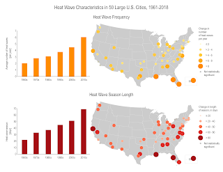
I'll be focusing on Heat waves. They occur more often than they used to in major cities across the United States, from an average of two heat waves per year during the 1960s to more than six per year during the 2010s. ... The average heat wave season across 50 major cities is 47 days longer than it was in the 1960s.
These bar graphs and maps show changes in the number of heat waves per year (frequency) and the number of days between the first and last heat wave of the year (season length). These data were analyzed from 1961 to 2018 for 50 large U.S. metropolitan areas. The graphs show averages across all 50 metropolitan areas by decade. The size/color of each circle in the maps indicates the rate of change per decade. Hatching represents cities where the trend is not statistically significant.


This summer the mega heat wave left California and other Western states enduring the hottest summer on record. That wave killed more than 1 billion sea creatures in the Pacific Northwest!

These are measures that can help mitigate heat waves as we adapt to heat: (or aqui en Español)

  • Provide community cooling centers, particularly in areas with low-income, elderly, and young populations
  • Ensure proper functioning of energy and water systems
  • Encourage citizens to check on their family, friends, and neighbors to ensure they have access to air conditioning
  • Communicate heat warning information and appropriate responses to the public (e.g., encourage staying indoors, provide symptom reminders)
  • Establish systems such as hotlines to alert public health officials about high-risk or distressed individuals
  • Encourage energy conservation to reduce demand on electricity systems
  • Implement load restrictions for older roads, bridges, and rail to reduce traffic on vulnerable transportation infrastructure

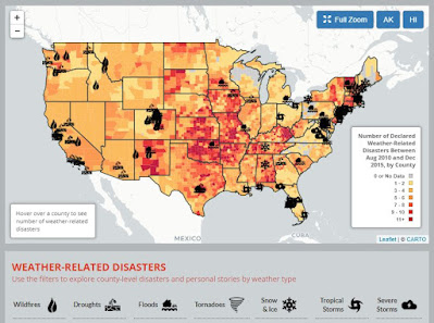
Sites like the Environmental America’s Extreme Weather Map (below) are interactive and help visualize the information of weather-related disasters  2010-2015. Every year, weather-related disasters injure or kill hundreds of Americans and cause billions of dollars in damage. Many of the risks posed by extreme weather will likely increase in a warming world. Scientists have already noted increases in extreme precipitation and heat waves as global warming raises temperatures and exacerbates weather extremes.

Map showing extreme weather events in US 2010-2015

The WunderMap is a really useful site to see the severe weather occurrences updated in the States.

Any of the websites I used here are great places to keep yourselves informed so we can prepare for an extreme weather event.


Stay safe and informed!


Saturday, October 2, 2021

Week 8: Mass Wasting Hazards in the US


This week we are discussing 'mass wasting' events...aka, landslides, mudslides, rockslides, etc.

These hazards are connected to others like earthquakes or flooding or wildfires.... although mass wasting events do not need any triggers (just gravity!). As an example, this year a 7.3 magnitude earthquake hitting NE Japan and provoking several landslides and rockslides (image below).

Landslide image by Hironori Asakawa/Kyodo News via AP


Landslides in the United States cause approximately $3.5 billion in damage and kill between 25-50 people annually. The US Landslide inventory map below shows these hazards widespread within the country.

US Landslide Inventory Map


The largest landslide in modern U.S. history (in terms of volume) was most likely one that occurred in 2013 in Bingham Canyon outside of Salt Lake City, Utah. It had a slide mass of 55 million cubic meters (compared to an estimated 10 million cubic meters during the Oso event in 2014).

Landslides impact California’s terrain often. These are generally related to precipitation patterns, in particular if there has been previous months of drought conditions. In January 2019, Pacific storms brought a lot of rainfall to the state. The heavy rain forced residents to evacuate from wildfire-ravaged areas. The “high risk” areas for mudslides are so because they are adjacent to steep slopes or are located at the base of drainage areas. Recent examples are the ‘Woolsey’ and the ‘Hill’ fire burn areas, which will be subject to high volume of mud and debris flow moving forward. 

If you want to know more about these hazards, the USGS page has great information on how to identify landslides and what to do if one happens. If you want to know if you are living in a risk area, you can access maps like the USGS below that shows the Emergency Assessment of Post-Fire Debris-Flow Hazards.


Stay informed and safe-


Saturday, September 11, 2021

Week 5: Volcanoes in the US

 There are 161 potentially active volcanoes in the United States (source). Most of these are located in Alaska, where eruptions occur virtually every year. Others are located throughout the west and in Hawaii (Ring of Fire anyone?). 


There are several ways we minimize the danger of volcanic activity (apart from the obvious of ‘getting out of the way’…(:

·         Forecasting (earthquakes as early warnings -although in 2014 a Japanese volcano erupted without any previous seismicity (livescience article), land swelling before eruption, gas emissions, etc.)

·         Volcanic Alert Codes (USGS): the levels of alert and the aviation code levels commonly change at the same time (chart on right). A non-erupting volcano will have a green icon, and a red one indicates an imminent eruption (see USGS Alert Codes).

Today the US hazards map (below) shows 7 volcanoes as to be above normal background (in watch or advisory levels):

  • Alert Level=WATCH. Aviation Color Code=Orange: Semisopochnoi, Great Sitkin , and Pavlof .
  • Alert Level=ADVISORY. Aviation Color Code=Yellow: Cleveland , Pagan , Mauna Loa, and Kilauea.


If you want to know more about volcanoes and how we monitor them, there is a MOOC from the University of Iceland you might want to enroll into. A short video explanation here

Saturday, August 28, 2021

Week 3: Earthquakes

 Week 3 explores earthquakes and what countries do to prevent/mitigate the hazard. If I want to know something about earthquakes in a place, the first websites I go to are: the USGS Real Time Earthquakes Website or the IRIS monitoring website.


Regarding where quakes are located in the US, this seismicity map below from USGS shows the (obvious, in hot pink) ring of fire portion on the West coast but also a central area in the middle of the plate. I’d like to talk a bit more about this non-obvious one. This area, called the New Madrid Zone was shaken by a M8(!) in 1811. The reason for the activity is a very old intraplate rift placed below the area (see image from http://showme.net).


The San Andreas Fault System is responsible for most of California natural quakes...Each year the southern California area has about 10,000 earthquakes.!! The latest swarm of quakes in the Salton Sea has been featured in the news often. Earthquakes up to magnitude 4.6 under the Salton Sea are raising concern that a larger quake could be unleashed on the San Andreas fault. The southernmost section of the fault has not ruptured since about 1680.

So, what can we do about it?; apart from the obvious need for education, I want to focus on the USGS ShakeAlert system, developed for the West coast using some of the existing systems. Today, the technology exists to detect earthquakes, so quickly, that an alert can reach some areas before strong shaking arrives. The purpose of an EEW (Earthquake Early Warning) system is to identify and characterize an earthquake a few seconds after it begins, calculate the likely intensity of ground shaking that will result, and deliver warnings to people and infrastructure in harm’s way. Studies of earthquake early warning methods in California have shown that the warning time would range from a few seconds to a few tens of seconds, depending on the distance to the epicenter of the earthquake. 
There is an Earthquake Tracker all Californians can download to keep informed: try My Shake App.


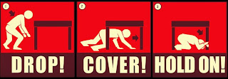
A few seconds of warning could make all the difference (enough to stop transit/elevators and to drop, cover, hold on).


Being aware of the risk and know what to do when the shaking starts is very important. We know that earthquakes cannot be predicted (I recommend Dr. Jones’ book called the big ones if you want more information about that)

Saturday, August 21, 2021

Week 2: Tectonics

This week we are exploring Plate Tectonics and how important it is to know the location of the plate boundaries, and how it is closely related to some natural hazards, like volcanoes or earthquakes.


In the US, the NOAA map below shows how the Easter part of the States is a passive margin, and the Western side of the country is a very active one, with the Pacific Plate, Cocos, Juan de Fuca plates connecting to the North American plate. Not a surprise we are on the ‘Ring of Fire’, where a lot of the volcanic and seismic activity happens!

Closer to home, the transform plate boundary called SAF (San Andreas Fault) is responsible for most of the shakingThese plates (North American and Pacific) are slowly moving past one another at a couple of inches a year; about the same rate that your fingernails growOur amazing SAF is also a right strike slip fault. 


Of course, there are a few exceptions, like the activity of Hawaii within the Pacific plate (hot spot) or the New Madrid area (ancient rift) within the North American Plate, both not at plate boundaries, but that will be another post another time...

We might not know when events like volcanic eruptions or big earthquakes will happen (a lot of these happen underwater...), but if you know your Tectonics, you definitely know where the (mostly) do!

Sunday, August 8, 2021

Welcome to Fall 2021: Earth's Catastrophes and Disasters

 Hello Geol9,


Welcome to class!


In this first post of the semester, Geol9 students will briefly introduce their chosen country. Those blogs will be used to discussing the different natural hazards and the mitigation measures that are in place for them. I will be working with the United States' natural hazards in mine so students can use my posts as a guide throughout the semester.

Stay tuned for those natural hazards...

Saturday, April 24, 2021

Coastal Hazards Wk

 When I think about coastal erosion, I think about Pacifica, CA, and the 2016 after el Niño related storms, when yet another chunk of sandy cliff was falling into the ocean and houses were in need of abandonment. A drone video of the area is clear. A lot of information can be found about how in a few years the cliff has eroded.


Recently two online portals have been developed as an interactive tool for any user to explore what coastal hazards are all about. Also, the National Assessment of Coastal Change Hazards of the USGS has very good information about coastal issues in the country.

The NOAA’s Sea Level Rise Viewer website let you browse over possible scenarios of sea level rise and coast vulnerability. A great link to try!


Today I am going to focus on another link, the USGS Coastal Change Portal. The USGS Coastal Change Hazards Portal is a new tool that allows anyone to explore how coasts change due to: extreme storms, shoreline change, and sea level rise.

Extreme Storms: this allows ‘real-time and scenario-based predictions of storm-induced coastal change, as well as the supporting data, are provided to support management of coastal infrastructure, resources, and safety.’ For example, let’s focus on the Gulf Coast and a scenario of a hurricane (any category). Let’s see how a Cat 1 and a Cat 5 possibly looks like (with probabilities of collision (dune erosion), overwash, and inundation for sandy beaches along the Gulf and Atlantic coasts during a generalized hurricane landfall): see figures for both. The most probable areas should be risks areas and treated as such in an emergency.


Shoreline Change: this shows: ‘historical shoreline positions and rates of change along ocean shorelines of the United States’. Looking into the East coast now, offshore Norfolk, see figures for long-term coastal change rates, and for the short-term rates (<30 years rates of shoreline change for open-ocean shorelines of the United States ranging from 1970's to 2001).

Sea level Rise: there are two methods used to address this: a Coastal Vulnerability Index (CVI), and a probabilistic assessment of shoreline change. 
CVI: ‘a preliminary overview, at a National scale, of the relative susceptibility of the Nation's coast to sea-level rise through the use of CVI. This classification is based upon the following variables: geomorphology, regional coastal slope, tide range, wave height, relative sea-level rise and shoreline erosion and accretion rates. The combination of these variables and the association of these variables to each other furnish a broad overview of regions where physical changes are likely to occur due to sea-level rise’. A quick image shown here shows how much red (very high vulnerability) our California coasts possess.

Probabilities of Shoreline Change: ‘this dataset was used to develop and evaluate the performance of a Bayesian network (BN) that predicts long-term shoreline change associated with sea-level rise. The BN is used to define relationships between driving forces, geologic constraints, and coastal response, which includes observations of local rates of relative sea-level rise, wave height, tide range, geomorphology, coastal slope, and rate of shoreline change. Using this information, the BN is used to make probabilistic predictions of shoreline change in response to different future sea-level rise scenarios’. 
As you can see this new tool will help tremendously to manage areas and to get a broad idea of what is happening on the US coasts.

Explore those links!-

Saturday, April 3, 2021

Extreme Weather in the US


We are discussing extreme weather events this week. This video from National Geographic is a  great one as an introduction to the material showing the interconnectivity of events.
I'll be focusing on Heat waves. They occur more often than they used to in major cities across the United States, from an average of two heat waves per year during the 1960s to more than six per year during the 2010s. ... The average heat wave season across 50 major cities is 47 days longer than it was in the 1960s.
These bar graphs and maps show changes in the number of heat waves per year (frequency) and the number of days between the first and last heat wave of the year (season length). These data were analyzed from 1961 to 2018 for 50 large U.S. metropolitan areas. The graphs show averages across all 50 metropolitan areas by decade. The size/color of each circle in the maps indicates the rate of change per decade. Hatching represents cities where the trend is not statistically significant.


Last summer California had the hottest August and September on record. The high temperature 97° in #SantaCruz on October 16th exceeded the previous record 96° on that day in 1974 and 1967!

These are measures that can help mitigate heat waves: (or aqui en Español)

  • Provide community cooling centers, particularly in areas with low-income, elderly, and young populations
  • Ensure proper functioning of energy and water systems
  • Encourage citizens to check on their family, friends, and neighbors to ensure they have access to air conditioning
  • Communicate heat warning information and appropriate responses to the public (e.g., encourage staying indoors, provide symptom reminders)
  • Establish systems such as hotlines to alert public health officials about high-risk or distressed individuals
  • Encourage energy conservation to reduce demand on electricity systems
  • Implement load restrictions for older roads, bridges, and rail to reduce traffic on vulnerable transportation infrastructure

On sites like the Environmental America’s Extreme Weather Map (below) one can see an interactive visual map with information  of weather-related disasters  2010-2015. Every year, weather-related disasters injure or kill hundreds of Americans and cause billions of dollars in damage. Many of the risks posed by extreme weather will likely increase in a warming world. Scientists have already noted increases in extreme precipitation and heat waves as global warming raises temperatures and exacerbates weather extremes.

Map showing extreme weather events in US 2010-2015

The WunderMap is a really useful site to see the severe weather occurrences updated in the States.

Any of the websites I used here are great places to keep yourselves informed so we can prepare for an extreme weather event.


Stay safe and informed!